
Responsive Web Design is an approach to web development that allows a website to automatically adapt and reflow its layout to fit the screen size of any device. In simple terms, you build one single website, and its content intelligently rearranges itself to provide an optimal viewing experience whether it’s on a widescreen desktop monitor, a laptop, a tablet, or a smartphone.
With a responsive site, users never have to pinch-to-zoom, scroll horizontally, or deal with text that's too small to read. Buttons are easy to tap, images resize gracefully, and the navigation is intuitive on any screen. This is the foundation of modern, user-centric web design.
Why Responsive Design Is Non-Negotiable for Business in 2025
What was once a "nice-to-have" feature is now an absolute necessity for survival and growth online. Here’s why your business cannot afford to ignore responsive design.
1. Google's Mobile-First Indexing is the Law of the Land
This is the most critical reason. Google now primarily uses the mobile version of your website for indexing and ranking. If your site provides a poor experience on mobile devices, your rankings will suffer across the board—even for users searching on desktops. A non-responsive site tells Google that you are not providing a good experience to the majority of users.
2. Superior User Experience Drives Engagement
More than 60% of all web traffic comes from mobile devices. When a user lands on your site and can effortlessly read your content and navigate your menus, they are more likely to stay longer, view more pages, and engage with your brand. This reduces your bounce rate and sends positive signals to Google about your site's quality, which is a core part of user experience (UX).
3. Higher Conversion Rates on All Devices
A seamless experience leads to more sales. Whether your goal is to generate leads, sell products, or get sign-ups, a responsive design removes the friction that causes mobile users to abandon their carts or forms. If a user can’t easily tap your "Buy Now" button, they won’t buy.
4. Protecting Your Ad Spend
Imagine you're running a Google Ads campaign. A user on their phone clicks your ad, and you pay for that click. But they land on a page that's impossible to use. They leave immediately. You've just wasted your ad budget. A responsive landing page is crucial for effective landing page optimization and ensuring that every dollar you spend on advertising has the best possible chance to deliver a return.
The Core Principles: How Responsive Design Works
The magic of responsive design is powered by three key technical principles:
- Fluid Grids: Instead of using fixed-width units like pixels to define the layout, responsive designs use a flexible grid system based on relative units like percentages. This allows the layout to stretch or shrink gracefully based on the screen size.
- Flexible Images: Images are also set to resize within their containing elements. This prevents them from "breaking" the layout on smaller screens and ensures they load at an appropriate size for the device.
- Media Queries: These are the "rules" that make responsiveness possible. Media queries are simple filters in the CSS code that check for the device's characteristics (like its width, height, or orientation) and apply different styles based on those characteristics. For example, a media query can say, "If the screen width is less than 600px, make the font size larger and stack the columns vertically."
The Modern Toolkit: Building Responsive Sites with Webflow and Framer
Today, creating sophisticated responsive designs is more accessible than ever, thanks to powerful visual development platforms.
Full Control with Webflow
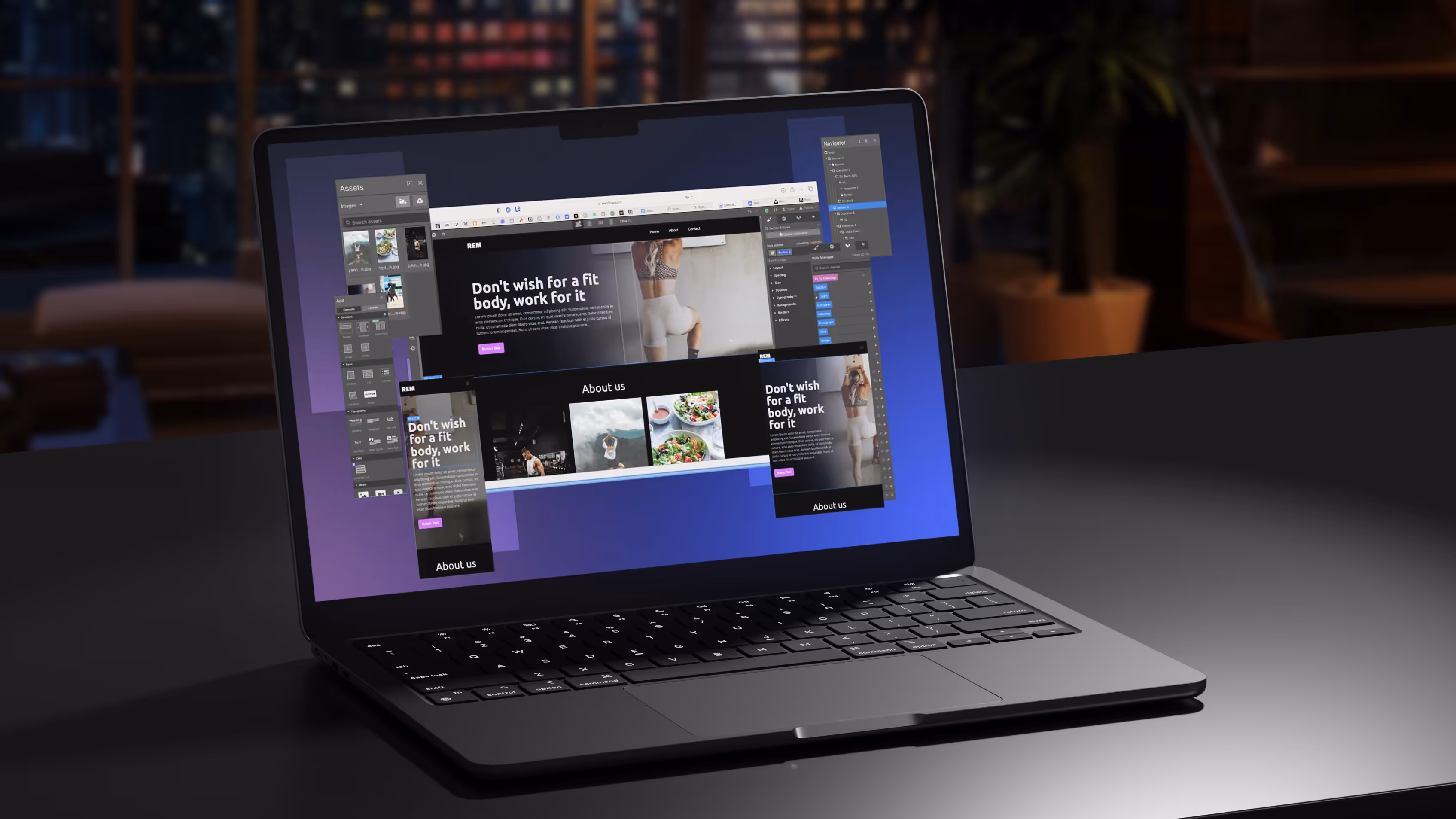
Webflow is a revolutionary platform that gives designers the power to build custom, high-performance responsive websites without writing code. It provides a visual canvas where you can design for different "breakpoints" (desktop, tablet, mobile) and have full control over how every element looks and behaves on each device. This makes the process of creating a pixel-perfect, SEO-friendly website faster and more intuitive.
Smart Adaptability with Framer
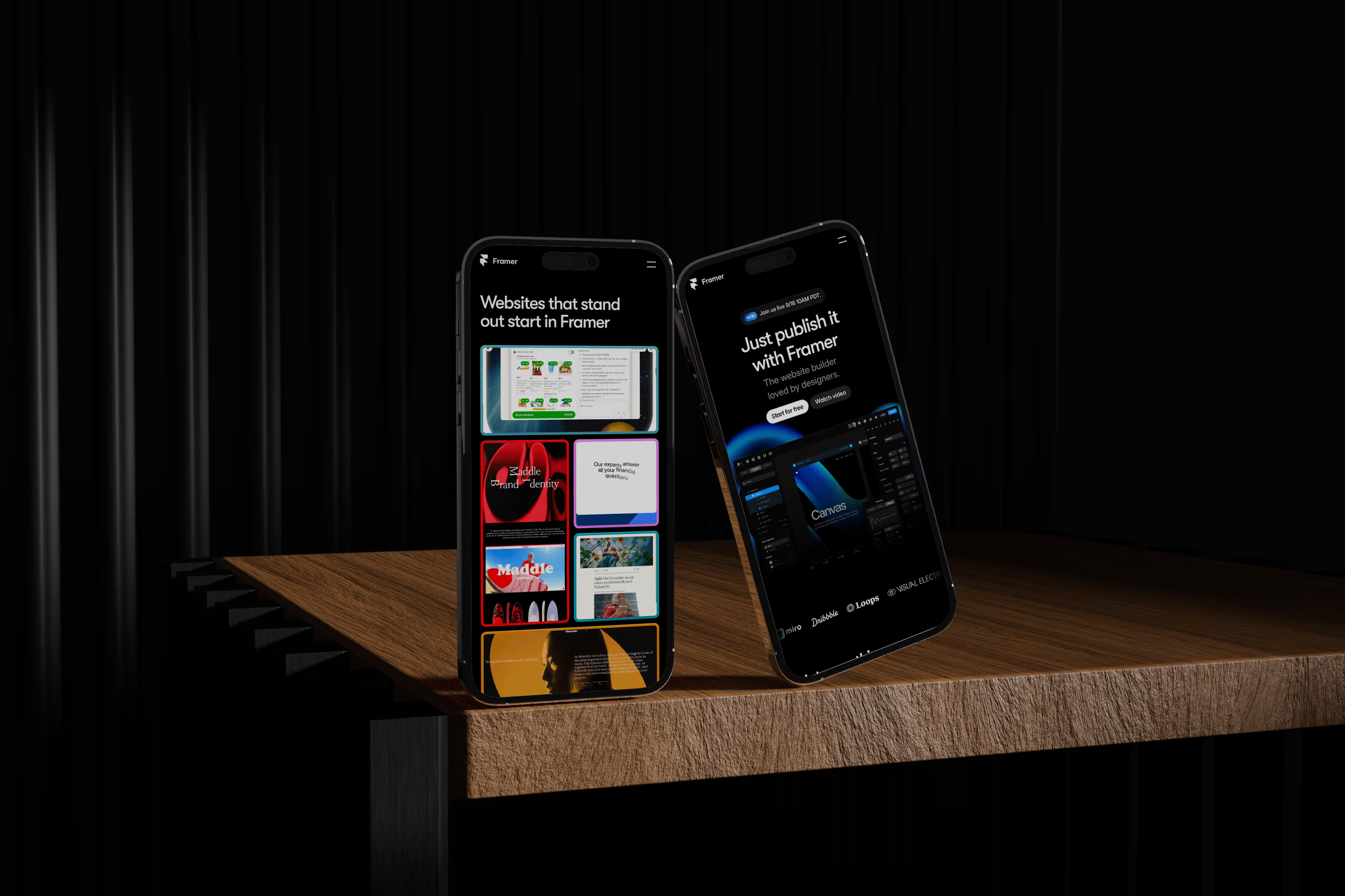
Framer is another cutting-edge tool that excels at creating interactive and fluidly responsive sites. Its smart layout features allow elements to adapt automatically based on their content and container, making the responsive design process incredibly efficient, especially for complex, dynamic layouts.
Is Your Website Responsive? 3 Simple Ways to Check
You don’t need to be a developer to check your site. Here’s how you can do it right now:
- The Browser Test: On a desktop computer, open your website. Click and drag the corner of your browser window to make it narrower. Watch the content as you do. Does it rearrange and reflow smoothly? Or does it get cut off?
- Use Mobile-Friendly Test: GJust search for "Mobile-Friendly Test," enter your website's URL, and it will tell you instantly if your page is easy to use on a mobile device.
- Use Your Own Devices: The simplest test of all. Open your website on your smartphone and a tablet. Can you read the text easily? Can you tap the menu buttons without zooming?
The Critical Link Between Responsive Design and SEO
Responsive design is fundamental to modern SEO. The relationship is clear:
- Google Recommends It: Google has officially recommended responsive design as the best practice for mobile configuration since 2012. You can read more about Google’s mobile-first indexing details.
- Improves User Signals: A responsive site leads to lower bounce rates and longer dwell times, which are positive user engagement signals that Google values.
- Boosts Page Speed and Core Web Vitals: Responsive designs, when built correctly, are optimized for mobile performance, which can improve your site's speed and Core Web Vitals scores.
- Avoids Duplicate Content: It uses a single URL for all devices, eliminating the duplicate content issues that can arise from having a separate mobile site (e.g., https://www.google.com/search?q=m.yourwebsite.com).

Conclusion: A Future-Proof Foundation for Your Digital Presence
In 2025, responsive web design is not a feature—it's the foundation. It is a direct reflection of your company's commitment to providing a thoughtful and accessible experience for all users, wherever they are. Investing in a fully responsive website is one of the most important decisions you can make to improve your SEO, maximize your conversion rates, and build a digital presence that is ready for the future.